A couple of weeks back I decided to write a post on the influences impacting
typewriter design. This post has been finished for a while, just unpublished. It was inspired in part by a conversation I had with Scott K
on the way back from a visit to John’s place in September. We were discussing
the depth of knowledge that the typosphere (with a notable mention of Robert Messenger)
delivers in relation to the corporations, patents and people behind different
typewriter designs. Scott pointed out however, that less often discussed in
the typosphere is the influence of the social and cultural contexts of the
era on a typewriter’s aesthetic design. I thought this was a good point.
Because designs are not dreamed up by designers in isolation, but are products
of the prevailing social, economic, even political conditions and sentiments of
the time. Thus the influences acting upon the designer of a given typewriter
make for a very interesting discussion; a discussion that with the help of the
typosphere and my university’s library, one that I’ve decided to have a crack
at. I share with Ton and many others a great love of Olivetti and I thought
what better place to start than the first typewriter I ever owned, the Olivetti
Lexikon 80.

Impatient Snow Collection
Ton S Collection (Ton S. 2012a)
There is already a wealth of information on the enigma
that is the Olivetti corporation (Marin 2009, Messenger 2011a, Messenger 2011b,
Ton S. 2012b, Ton S. 2013- full references at the end of the post). There is also plenty of information
available on the Lexikon 80 and later varients (Ton S 2012a, New York MOMA etc
etc) including of course Rob Bowker's info on his own awesome green Graphika. We know already that the Lexikon 80 (released 1948) is an iconic design
by an iconic designer, one which has found its way into millions of offices,
homes, the New York Gallary of Modern Art, countless blog posts and Industrial
Design textbooks. It was designed by Marcello Nizzoli (1887-1969) in
collaboration with engineer Guiseppe Beccio. Nizzoli was a painter, designer
and graphic designer who began work for Olivetti in 1930, rising through the
ranks to become head product design consultant by 1936 (www.marcello–nizzoli.com).
However, while Nizzoli was the designer of the Lexikon and this machine is correctly attributed to Nizzoli’s incredible imagination, it should also be seen as very much a product
of the time and a precursor for much to come.
New York Gallery of Modern Art Collection: Source: http://www.moma.org/collection/artist.php?artist_id=4316
Impatient Snow Collection
The year the Lexikon 80 was released (1948) was an
important year for Italian Industrial Design. Woodend (1997) quotes Andresa
Branzi as saying that Italian design of the 50’s should really be seen to begin
in 1948. The general elections in Italy in 1948 installed a centrist government
with an eagerness to develop markets and stimulate the economy. This government
correctly identified promoting Italian design and production as a means of
doing this. The export of fashion, appliances, motor-vehicles and (I assume)
typewriters to the rest of the world, played a part in Italy’s exports shooting up by a whopping 259% between 1951 and 1962 (Woodend 1997). For
comparison England and France posted increases of 29% and 86% respectively
during the same period (Woodend 1997). What this means, I assume, is that the Italian
industrial design and manufacturing industries at the time the Lexikon’s and
Lettera 22’s were selling, had the confidence of the government; a government
who was keen to promote and export designs and to open up new markets. Designs
shifted towards elegance and top-notch workmanship, targeting the quickly
burgeoning high-end markets. This provided for a “move away from democratic
idealism toward a more style-conscious aesthetic geared towards the pockets of
the more affluent sectors of society” (Woodend 1997, pp.123).
The products of Industrial Design in post-war Italy were, in
my opinion, downright gorgeous. Italy was a distinct trend-setter in design during this time and Italian designs of the late 1940’s played a
large part in shaping and determining what we now associate with 50’s fashion. While the Lexikon 80 is original in its own right, close parallels
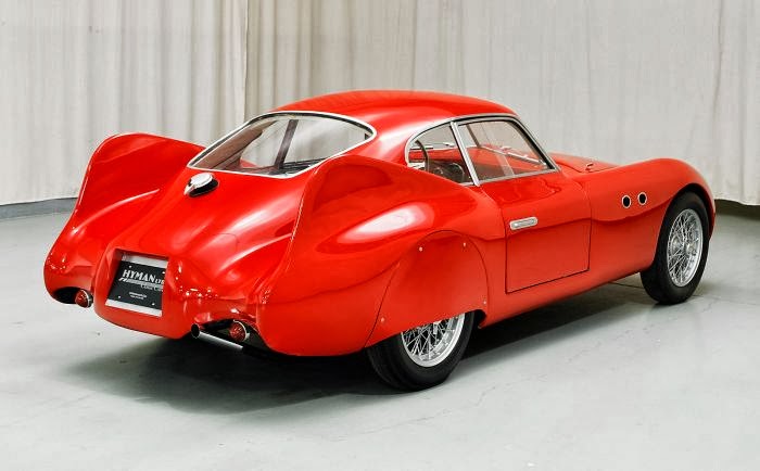
can be drawn between Nizzoli’s 1948 Lexikon 80 with Italian automotive designs of the time, including the curves of the original
Vespa motor-scooter of 1946 and the Cisitalia 202 sports car of 1947. Following this style as well is the stunning Gio Ponti designed La Pavoni coffee machine of 1949.
Source:
http://www.scootermaniac.org/modele,Piaggio,Vespa-98,38.html
Source:
http://images.hemmings.com/wp-content/uploads//2013/03/1947Cisitalia202MM_02_700.jpg
Source:
http://www.alfa-male.com/italian-design/architecture/
The aesthetic of this design has been described as an “organic
sculptural form”. Now I freely admit I’m not quite arty enough to know what this
really means, but whatever it is, it is clearly a form which Nizzoli followed
in his other designs for Olivetti in the late 40’s and early 50’s including the
Divisumma 14 (1947), Summa 15 (1949) and
of course the beautiful Lettera 22 (1950).
New York Gallery of Modern Art Collection: Source:
IDE Virtual Design Museum Collection. Source:
Summa 15: Source:
Impatient Snow Collection
Where Italy went, the world followed. One of my favourite car designs, the iconic Australian built FJ Holden, was released five years after the Lexilon 80, in 1953, but it still looks like the automotive equivalent of hopping right inside your own
Lexikon 80 and driving off.....
Source:
References
Marin, Fransu (2009) Hispano Olivetti- a brief history.
ETCetera #86, June 2009.
http://www.marcello-nizzoli.com/
Woodham, J.M. (1997). Twentieth-Century Design. Oxford
University Press, Oxford UK


.jpg)


